If your goal is to enhance the traffic on your website through banner ads, you might be thinking about how to create an alluring website banner design. A kind of design that would be attractive to people and they would want to click on it. Eventually, it targets the organized formation of productive ads via cautious implementation of primary design recommendations. In this blog, you will find all the necessary information you would want in order to establish productive banner ads.
What actually website banner design is?
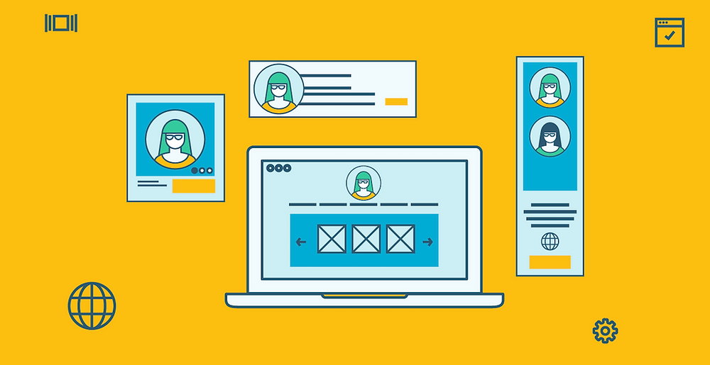
It is one of the greatest common kinds of internet advertising, and it exists in many types and sizes. The goal of banners design is to make the highest clicked banner ads imaginable. These are the kind of advertisements in which pictures are immersed on the landing page of any website that displays the products or the brand as well as the link to the advertiser’s site. Several organizations utilize them since they are affordable and effective means for the brands that increase their visibility. However, the question is that how are you going to make the kind of banner ad that could bring more clicks? Here are some of the tricks to create that kind of banner ad.
Tips to create a well-designed banner ad
It’s crucial to create the right sized banner and the way you’re gonna design the graphics. To make it easy below are the standard sizes that are still being used:
- 728×90px — Leaderboard
- 300×600px — Half Page
- 300×250px — Medium Rectangle
- 336×280px — Large Rectangle
It’s crucial how you place it
If you want to know where the users are mostly going to see ads or where you should place your ad in order to get the most clicks, you could use analytic data. In this way, you can get away with the guessing work. There are softwares for user tracking, try using one to make your work easy. For catching people’s attention you need to place your ad in the area where you think it wouldn’t interfere user’s experience and still get the attention you want. For instance, you can place your ads just at the bottom of a featured news portion on your favorite digital news website. It’s the perfect place since you are not interfering in UX and still getting your ad in front of people.
Necessity of hierarchy
You need a properly structured hierarchy in order for people to understand your web banner. Your design is totally based on it’s balance and of course the three primary elements of every website banner design.
- Your company logo should be prominent enough that it can be seen pretty easily at first glance.
- Need to set the value proposition such as the displaying the products which usually need large space
- Include a call to action button and should be placed at the end of the ad so it could be the next step people would take if they understand the visuals and graphics and obviously if that sparked their interest.
Try to keep it consistent
As you are aware that the banner ad is going to be linked with your page on your website. So, it’s important that you tell your story from the start (the moment people see your banner ad). Well, keeping that in mind would it be wise to go for a completely different design and branding? Because it is the probability that people would go on your website after seeing your ad and after landing on your website possessing a different theme and logo, they might think that they must have landed on the wrong one. Would you really want to give this impression to your possible clients? However, website banner design possessing a similar theme as the website could be really attractive and influential.
Ensure CTA is clear and effective
I have already told you the importance of CTA, here I’m making you understand once again. Because it is the only opportunity to tell the users what they should do next. If you are missing this component from your banner ad then it doesn’t matter if you have the best design, people would be confused about what they have to do next. Even when people click on the ad they could land on the page that they didn’t anticipate depending on what was suggested on the banner ad.
Think about animating the visuals
One must constantly endeavor to make the most of whatever talents they get under their control. It incorporates animated visuals when it comes to banner ads. The outcome could be an eye-catching, strong online ad that the viewer would at least stare at if used in conjunction with great writing plus clear graphics. A great technique would be to utilize animation to guide your visitor to the second step, such as “watch this now”!